
01 Context and problem
LATAM Airlines issues Travel Vouchers to passengers affected by flight contingencies — delays, cancellations, diversions. The voucher entitles passengers to a bank transfer reimbursement. On paper, a clean resolution to a stressful situation.
In practice, the experience was broken at every level. Of all vouchers issued monthly, only 54% were ever redeemed. And of those, 85% required calling the Contact Center — meaning passengers had to relive a stressful airport moment, wait on hold, and depend entirely on a third party to complete a process that should have been self-service.
Business problem
High operational cost
- Only 54% of issued vouchers redeemed
- 85% of redemptions via Contact Center (high cost)
- 15% online redemption rate — far below target
- Low satisfaction scores dragging brand perception
- No visibility into why digital redemption was failing
Human problem
Already frustrated passengers
- Passengers already frustrated by a flight disruption
- Physical document had unclear number format — hard to enter digitally
- No guidance on what 'Travel Voucher' meant or where to find it online
- Process differed by country, bank and language with no clear instruction
- Users felt abandoned after the airport — no follow-up, no status visibility
02 My role and scope
I owned the end-to-end design and strategy for the new digital Travel Voucher service — from initial research through to global launch across 24 countries and 6 languages. This meant working across the full product surface: the digital redemption flow, the physical voucher document, the transactional email system, and the airport agent communication.
This was not a screen redesign. It was a service design problem that required intervening at every touchpoint where the experience was breaking down.
03 Research and discovery
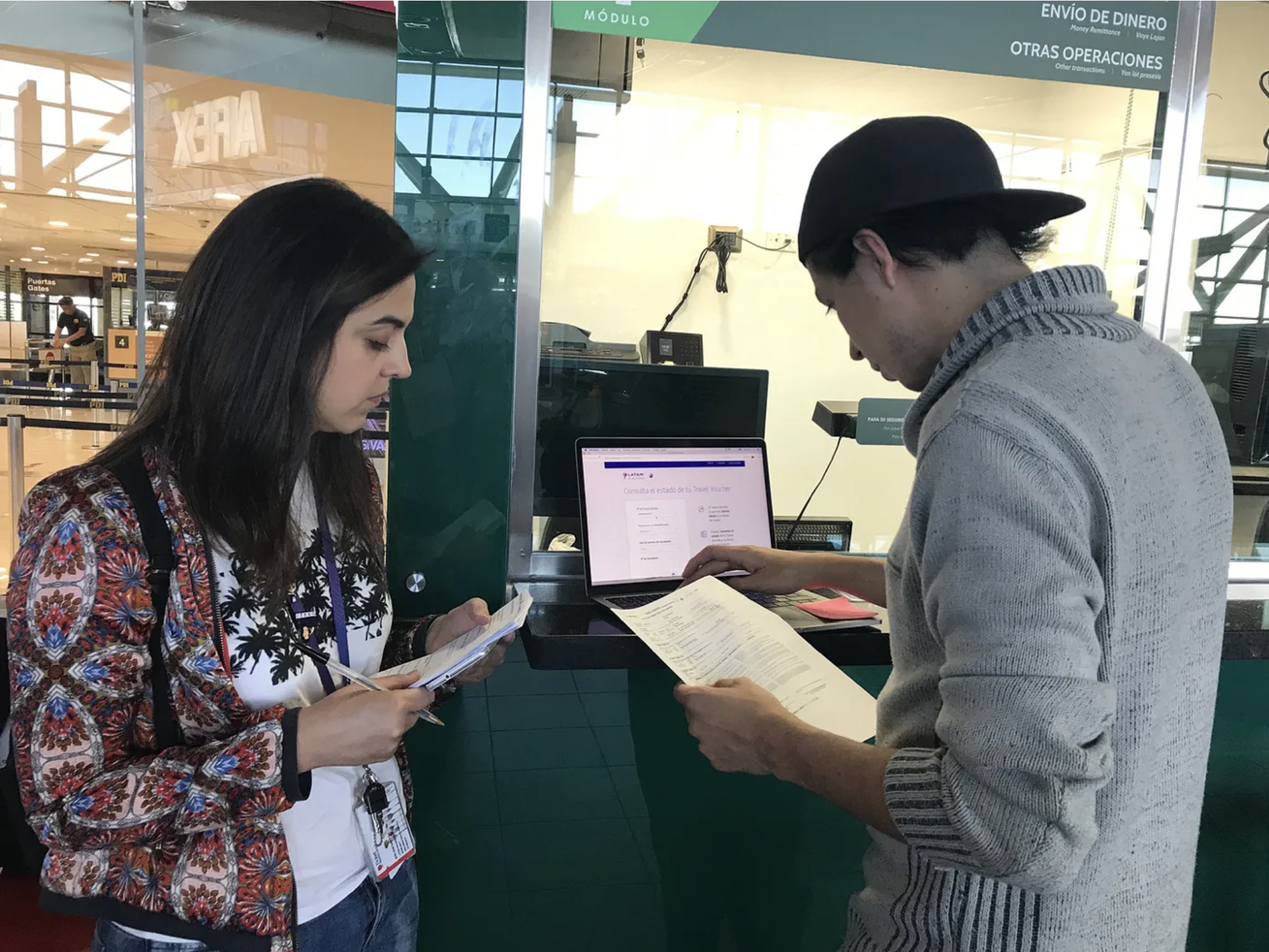
To understand the problem in full dimension, I did field research at Guarulhos International Airport in São Paulo — LATAM's largest hub — during an active contingency. That gave me direct access to the moment of voucher handoff: the emotional state of affected passengers and how they interacted with the physical document.
"The digital flow wasn't failing because of poor UX. It was failing because the physical artifact that triggered that flow was broken."
I conducted 12 in-depth interviews with passengers who had received a Travel Voucher between March and September 2018. The journey map revealed 5 distinct failure points, each corresponding to a different touchpoint in the ecosystem. None was purely a digital problem.
In parallel, a benchmark of 10 services across different industries — airlines, banks, insurers, Netflix, Airbnb, Spotify, Uber — revealed what successful refund flows had in common: they verified identity early, set clear expectations about timing, and sent proactive updates.
04 Design decisions
1
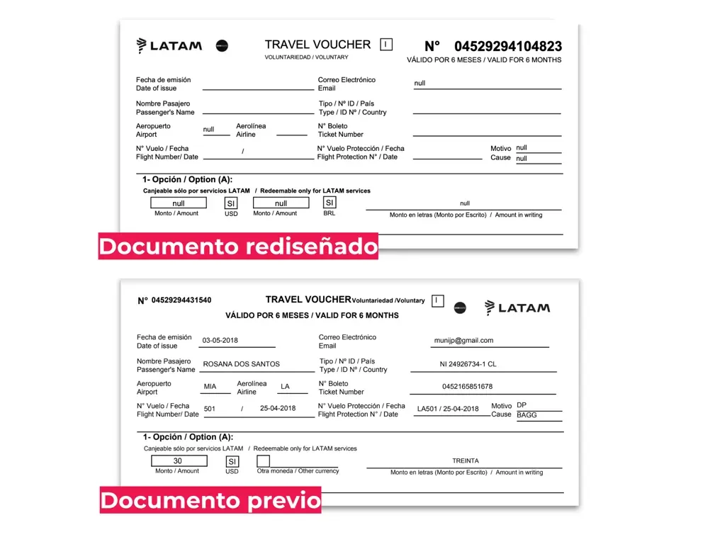
First, redesign the physical document
The first and most counterintuitive decision was not to start with the screen. We redesigned the printed Travel Voucher so the redemption number was visually dominant, scannable, and unambiguous. We changed format, increased contrast, and restructured the document hierarchy.
2
Before improving the flow, improve discoverability
Card sorting and a mass survey showed users didn't associate "Travel Voucher" with "refund." We moved the entry point to match real mental models, which increased organic service discovery without marketing spend.
3
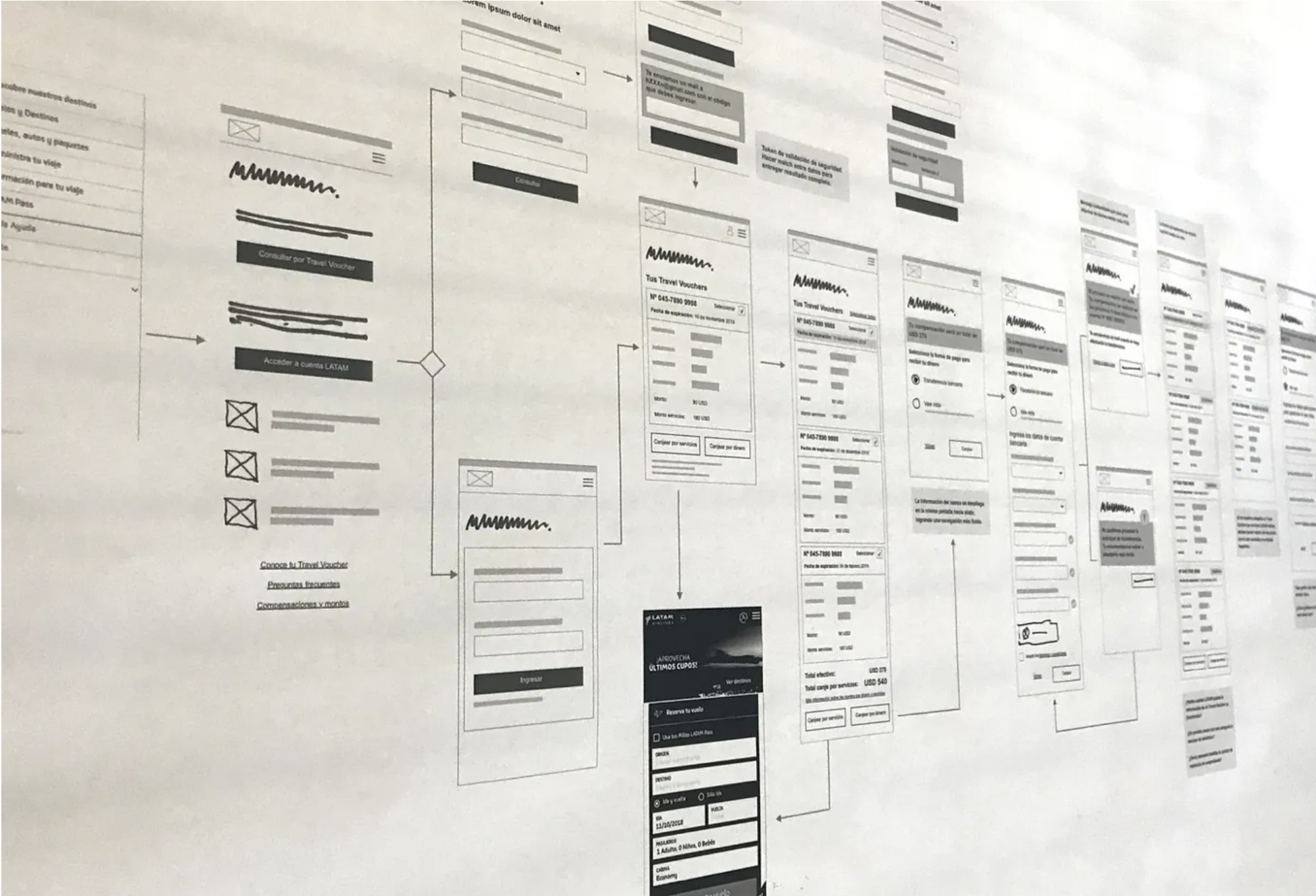
The digital redemption flow
I designed the input screen with a placeholder showing the exact voucher format and a contextual lightbox indicating where the number is on the physical document. A responsive form with banking requirements for 24 countries, fully accessible with screen readers.
4
Close the loop — retroactive emails
Passengers with unredeemed vouchers received a redesigned email: voucher number large and centered, in two languages. Tested across mobile, desktop, and webmail clients in 6 languages before global rollout.
05 Results
The product launched globally in 24 countries, 6 languages and banking forms for 90+ countries. Completely autonomous — no agent or Contact Center dependencies.
+165%
Digital redemption
From launch to 3 months after
4.6
Satisfaction (from 2.1)
2,503 responses across countries
−18.5%
Contact Center calls
For redemption and status inquiries
5:40
Average minutes
Vs. 30+ minutes by phone
"El proceso es fácil y sencillo. Cero problemas, gracias." / "It was very straightforward, thanks!"
User feedback post-launch · selected from 2,503 responses
The design work was presented as a showcase of LATAM's UX practice at Interaction Latin America 2019 in Bogotá — the largest UX conference in the region.
06 Key learnings
Product design is a system problem, not a screen problem
The Travel Voucher case is the clearest example in my career that the most impactful design work often happens away from the screen. Fixing the physical document was the decision that unlocked everything else.
Emotional context shapes everything
Designing for contingency passengers means designing for people in a low emotional state. Every copy decision, every loading state, every error message was evaluated against one question: does this make the passenger feel the airline is caring for them?
Consistency across touchpoints is a strategic decision
Coordinating the redesign of the physical document, the digital flow, the emails and the agent communication scripts required aligning stakeholders across multiple business units. That alignment work — making the case for why every touchpoint needed to tell the same story — was as much a part of the design as the Figma files.